Showing posts with label clashing colors. Show all posts

Monday, June 30, 2014

Soft and Splendid

Splendid is another brand that fits into my casual weekend wardrobe perfectly: soft, comfortable, effortless, and affordable. This maxi tank dress I bought last summer is exactly how I define summer casual chic. When the temperature hits the higher 80's, I want nothing but a simple dress that wicks my sweat away. The tank top cuts a little too low for me, so I usually wear a sports bra that adds a little pop to the palette as well as minimizes the visual effect of chest. Sometimes the secret of looking sexy is a right dose of being conservative. Hope we all have a splendid weekend ahead!

Click for large picture.

Maxi dress: Splendid (similar in grey/white, similar in poppy printshort dress, jumpsuit, long sleeved maxi, similar in other brands: #1, #2, #3 )
Sunglasses: Karen Walker Super Duper Strength
Sandals: Pedro Garcia Xola Ankle Strap Sandals in almond/white (also available in high heels
Purse: Louis Vuitton

Tuesday, March 11, 2014

Statement Accessories & Clashing Colors

概要

上次我们讨论了怎么穿撞色。今天谈谈另外一个撞色的小技巧:除了使用中间色以外,配饰在撞色中也非常重要。

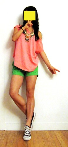
一般说来,穿撞色的时候配饰要尽量简单。除非你品味超群,最好少用亮晶晶的吸引眼球的配饰,因为那样就看起来太busy了。用一两个大号的能增强整体感的手镯 项链或者耳环可能会是个好主意。

比如这身打扮里面,resin的大项链(Anthropologie)就非常重要,里面既有上衣(Free People)的珊瑚红,也有裤子(JCrew)的绿色 ,能够把不搭边的上下两件拧在一起,于是整体感就出来了。

题外话,我发现Anthropologie家的配饰挺不错的,建议大家有空经常看看。


We talked about how to wear clashing colors last time. Today I'm here to show another important tip to make clashing colors work together. Besides neutral colors, statement accessories are also instrumental in creating a harmonious outfit of clashing colors.

When you wear clashing colors, you'd better keep your jewelry simple, just as I did in my red+green post. Unless you are really confident about your taste, you'd better keep "bling blings" (shiny diamonds / CZ / rhinestone accessories) to a minimum. They tend to create distraction and noise in your overall look. Instead, pick one piece of large chunky bracelet / necklace or one pair of chunky earrings that blends in and provides a sense of continuity through the clashing colors.

Take a look at this outfit: I used a chunky resin necklace (Anthropologie) that has both coral and green that united the coral top (Free People) and green shorts (JCrew) and created a continuous look in the outfit.

BTW I find Anthropologie has a good collection of unusual accessories. Keep an eye on it! :)


Thursday, February 20, 2014

Red + Green = Christmas Tree? Scratch that!


Abstract

How to wear red with green without looking like a Christmas tree? It's actually easier than you might think. 
  • Play with brightness and saturation. Furious red and blinding green are simply, er, furious and blinding. Mute one of the two colors and let the other one shine. That's the way to make it "pop", not "clash".
  • Play with area. Usually it's safe to let the muted color dominate in terms of area. Balance is the key, isn't it?
  • Use neutral color(s) to soften the look. 
Simple rules, right? Let's give it a try!

This is a quick flashback from 2012. The green top is from JCrew. I simply love their Perfect Fit Ballet Button Tee. I have ~20 pieces in different colors and sleeve length. I got the skirt from Anthropologie and flats from Stuart Weitzman. Cute stuff!

俗话说:"红配绿,丑得哭。"不知什么时候开始,红色和绿色放在一起成了村姑的标志。其实,红有各种红,绿有各种绿,如果自然界的红花绿叶美不胜收,为什么我们就不能把这两个颜色搭得赏心悦目呢?

今天放个flashback,以前搭过的一身儿红绿配,被很多人夸奖过,包括同事朋友,也包括街上的陌生人。正好来讲讲如何撞色 -- 撞色搭好了,会有意外的惊喜哦!

首先,我们知道颜色除了有色相,还有亮度明度灰度饱和度。我不是专业人员,这些名词一直稀里糊涂的,但是我的眼睛告诉我,鲜艳明亮的红色和鲜艳明亮的绿色在一起是很可怕的事情,所以这两个颜色一定要有主次之分,有明有暗才能有主有从。比如这身搭配里面,绿色是暗沉的背景,红色是那点活泼的splash。

其次,相撞的两个颜色面积上也要有主次之分,一个大一个小。一般说来,暗色偏大,亮色较小,这样才显得生动活泼,而不是哗众取宠。万绿丛中一点红,就是这么个意思。

第三,利用中间色过渡,通常可以使画面更和谐自然,比如这里使用的白色。

挺容易的,对不对?

这是2012年的图了,上衣是JCrewPerfect Fit Ballet Button Tee。我特别喜欢他家的这个tee,弹性非常好,颜色也很多,长袖短袖我收了~20件吧?裙子是Anthropologie的。鞋是Stuart Weitzman家的。